Your data, analyzed by a team of AI agents.
Connect a data file or a database and watch specialized agents clean it, form hypotheses, debate them, and visualize what matters — then ask follow-ups in plain English on a live canvas.
A focused pipeline, built to extend.
Everything listed above is shipping today in main
Not one model. A pipeline of specialists.
Most AI data tools throw your question at a single model. Insight Orchestra runs a pipeline of focused agents, each doing one job well — and each one shows its work.
Data Janitor
Cleans and profiles your dataset: types, duplicates, missing values, outliers, and bias flags.
Hypothesis Bot
Generates candidate insights and relationships worth investigating.
Debate Manager
Scores and debates the hypotheses, surfacing a confidence-ranked consensus.
Viz Whiz
Picks the right chart for each finding and renders it, with the code behind it.
Insight Summarizer
Writes the plain-English narrative you read first, plus follow-up questions worth asking next.
Then it hands you a workspace — keep asking, and the canvas keeps answering.
Big charts. Real answers. Confidence scores.
Every insight comes with the evidence behind it — a confidence bar, a business-value bar, the chart that proves it, and the Python that produced it. No black box.
- Top insight surfaced first, with the source numbers inline
- Overview and Results tabs — never cramped in a chat bubble
- Suggested follow-ups generated from what the agents found
- Switch models mid-conversation, with a live token + cost meter
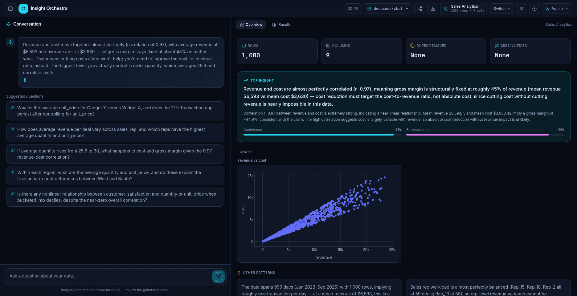
A real analysis workspace, not a chat box.
Two-pane workspace
Conversation drives; a wide canvas visualizes. Ask on the left, watch charts build on the right.
Ask in plain English
NL → sandboxed Python → charts and answers.
Live, full-size charts
Results render big on the canvas — never cramped in a chat bubble.
Pin & compare
Side-by-side compare grids to weigh findings against each other.
Refine on the fly
"Bar chart, color by region, log scale" — iterate conversationally.
Streaming answers
Responses type out live with animated canvas transitions.
Bring your own model
Switch between OpenAI, Anthropic, DeepSeek, or local Ollama — with a live token + cost meter.
Connect anything
CSV, TSV, Excel, JSON, or Parquet files, PostgreSQL, MySQL, SQLite, or DuckDB, plus demo datasets.
Persistent history
Every analysis is saved — reopen, compare, or delete past runs.
Export & share
Interactive HTML, PDF, Markdown, CSV — or a read-only share link.
Command palette
⌘K to jump anywhere — keyboard-first.
Data preview
See a live sample of your cleaned data right in the canvas before you dig in.
Sandboxed execution
Generated code runs in RestrictedPython — safe by default, inspectable by you.
Ready for a team, when you are
Flip one switch for login, role-based access, SSO via OpenID Connect, self-service API keys, and an audit log. Off by default — single-user local runs never see a login screen.
Yours to run, change, and keep.
Apache 2.0, self-hosted by design. There's no paid tier to graduate to and no seat count to manage — just source you can read, run, and shape around how your team actually works.

Use it commercially, modify it, redistribute it.
Runs on your hardware. No accounts, no seats, no usage caps.
Your data, your model keys, your infrastructure.
Add an agent to the pipeline, or fork the whole thing.
Up and running in two commands.
Self-host with Docker — your data and your model spend stay yours. The setup wizard asks which LLM provider to use, writes your config, and pulls prebuilt images.
Prefer a single line? curl -fsSL .../install.sh | bash clones and runs the same wizard — full command in the setup guide.
$ git clone https://github.com/laban254/insight-orchestra.git
$ cd insight-orchestra && ./setup.shYour data doesn't leave your environment.
Insight Orchestra runs locally via Docker. Use a local model (Ollama) for fully offline analysis, or plug in a hosted provider with your own key. Either way, you control where your data and your spend go.
Ask the questions you've been putting off.
"Which regions drive revenue, and what correlates with it?"
"What separates our top 25% of customers from the rest?"
"Flag outliers and data-quality issues before they skew reporting."
Built for trust and reproducibility.
Generated code runs in RestrictedPython — safe by default.
Inspect and copy the Python that produced each chart.
Each hypothesis comes ranked so you know where to look.
FastAPI · Next.js · Redis · Plotly · Docker Compose.